

Date
The Brothers Sauce
The Brothers Sauce
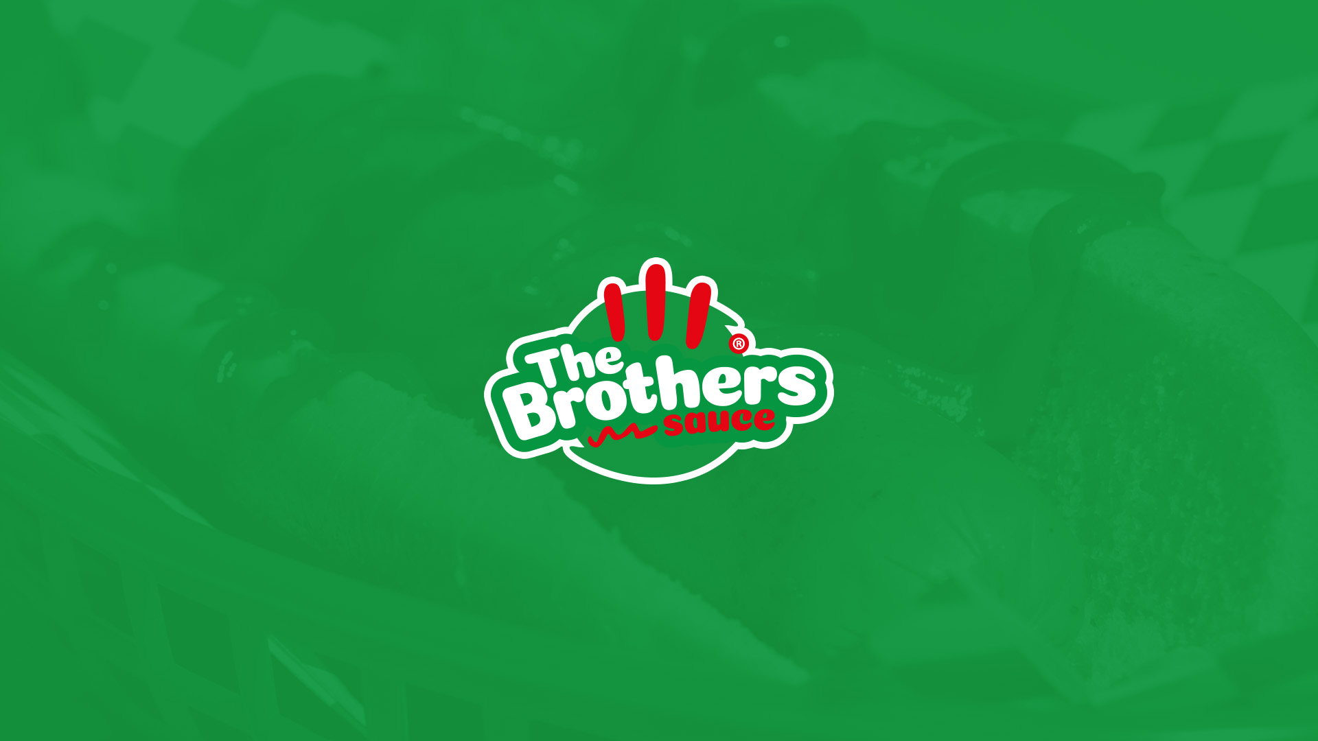


Main Logo
This version of the logo will be used the most. And this colorway will be the most important and most recognized colorway

Logo Variations
Secondary logo is a simplified version of the main logo, designed to be versatile and easy to use across various mediums

Structure
The structure built around the creation of a logo defines the underlying design system, encompassing visual guidelines, conceptual principles, and brand strategy elements that ensure consistency, scalability, and long-term identity coherence

Spacing
The dimensions referred to are the absolute extreme smallest size that allows for a good amount of legibility for the symbols and lockups

Font
Coiny Cyrillic is an ideal headline font for the brand, making a bold, modern statement that enhances visual hierarchy and adds creativity to the brand identity. It reinforces the brand commitment to innovation and professionalism, leaving a lasting impression. It should be used strictly for headlines, titles, and eye-catching design elements, allowing the brand to make a memorable impact and stand out in a competitive market